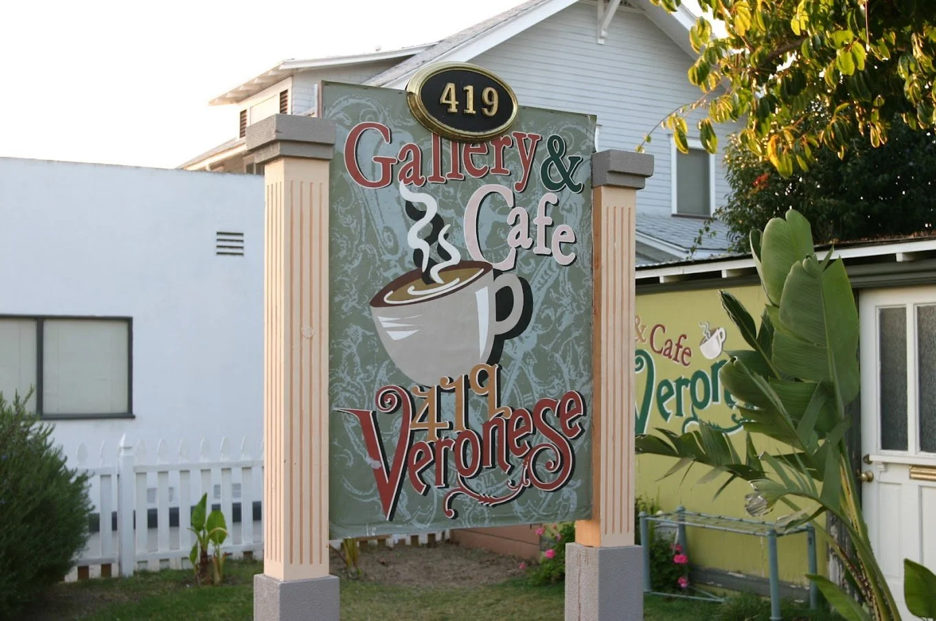
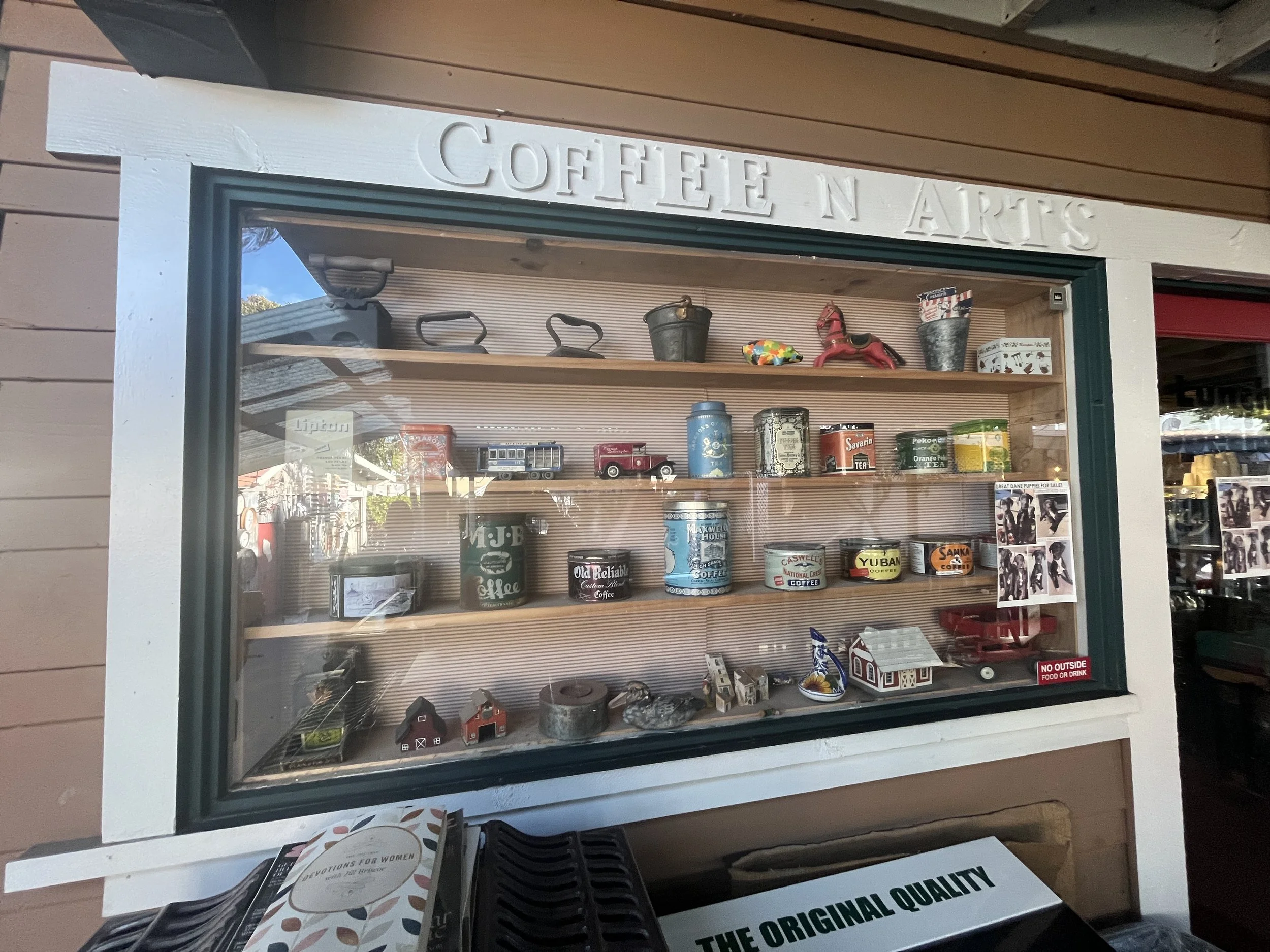
Veronese is a Korean family owned gallery & cafe in the heart of down town Fullerton that focuses on catering to the students in the near by colleges.
I made a design for a rebrand to strengthen the brand identity and to catch the attention of the target audience.
The Original Logo

Mood Board 1
Moody/ Antique/ Modern Day Victorian
Mood Board 2
Homey/ Comforting/ Mom and Pop
The Redesigned Logo
Logo
Sub Logos
Veronese Gallery & Cafe gives off a very homey, modern victorian feel the moment one walks in. That Is why I decided to adopt the victorian style of a decorative drop letter for the"V", but with a more modern twist. The decoration on the "V" doubles as steam from a coffee mug for a submark logo as well as a few other creative depictions to represent the Gallery.
The "419" In the submark logos represents the well known address that Is displayed throughout the cafe.
Color Palette
The color palette was inspired by the colors one can find throughout the cafe. They are meant to invoke the feel of a homey, cozy, moody, and antique environment.


